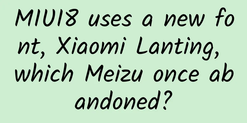
MIUI8 uses a new font, Xiaomi Lanting, which Meizu once abandoned?
|
Yesterday was the big day of the release of MIUI 8. In addition to the regular updates, Xiaomi also emphasized the update of the font "Xiao Milanting Font" in MIUI 8. Xiaomi said: From the adjustment of the center to the center of gravity design, all have been carefully designed according to the display and reading characteristics of the mobile Internet. From 6763 commonly used Chinese characters, punctuation marks, and Latin letters, to the full character library of 27533 Chinese characters, the Xiao Milanting font was carefully polished with Founder. Today, MIUI 8 redefined the Chinese mobile reading experience of Xiaomi mobile phones. In addition, Xiaomi also stated that they are the third manufacturer to customize fonts for mobile terminals after Apple and Google. Seeing this, I can't help but applaud Xiaomi. After all, fonts are a long-standing problem on the Chinese Internet. Whether it is a serif font like Songti or some weird fonts like DynaFont, they are all visual disasters. Xiaomi cooperated with Founder, a veteran font design company, to release the Xiao Milanting font, which is undoubtedly a move that pays attention to details and experience. Moreover, the beautification of Chinese Internet fonts has only been gradually taken seriously in recent years. The participation of Xiaomi, a player of this level, has also stimulated other manufacturers. However, looking back on the affairs of some other manufacturers, there is still a lot of love and hate to talk about when Xiaomi updated its Xiaomi Mi Ranting font. (Xiaolan Lanting font) Lanting font, once abandoned by Meizu Back in September 2014, when Meizu Flyme 4 was released, Meizu also updated the system font. In this description document, Meizu said: Founder Lanting Slim Black is an excellent Chinese font that can provide a Chinese reading experience better than Droid Sans, but it is a pity that the Founder Lanting Slim Black series only supports simplified and traditional Chinese, and does not support Korean and Japanese. The effect of mixed typesetting of Chinese and Korean characters or Chinese and Japanese characters is not ideal. After being implanted into the system, the thickness of multi-language fonts will be uneven, so we decisively abandoned this solution. At that time, Google and Adobe cooperated to release the open source font - Source Han Sans. In fact, in addition to Google and Adobe, there are three Japanese, Korean and Chinese font companies, Iwata, Sandoll and Changzhou Huawen, which participated in it. As a result of the cooperation of the three companies, Source Han Sans solves the problem of incoordination of Founder Lanting Slim Black when mixed typesetting of Chinese, Japanese and Korean characters. In the Android system, Google uses the new Roboto font for English, which optimizes the reading experience of English on mobile terminals. However, the accompanying Android default Chinese font Droidsans Fallback has been criticized for a long time: For a long time, Android's support for Chinese fonts has been very poor. Basically, when designing applications, you can only use the default Droidsans Fallback as the Chinese font. Droidsans Fallback does not include multiple weights, making it extremely difficult to use thick and thin contrast to highlight the importance of the common method in design. In addition to weight, many font designers also believe that many characters in Droidsans have heavy splicing marks, which is not natural. Therefore, whether it is Founder Lanting Black or Source Han Sans, they can get along well with the Roboto font in English, and both have multiple weights to facilitate design. It is much better than the previous default Droidsans font. The main difference between them is that Founder Lanting Black is only friendly to Chinese fonts, while Source Han Sans includes fonts for Chinese, Japanese, and Korean. Finally, in 2014, Meizu chose Source Han Sans, which they considered to be "better and more comprehensive", and abandoned Founder Lanting Slim Black, and continued to use it in the current Flyme 5. Xiaomi said that Lanting font is better than Source Han Sans From Xiaomi's previous statement, we can roughly guess that the Xiaolanting font Xiaomi used this time is actually a member of the Founder Lanting Black family. Currently, there are more than ten Founder Lanting Black fonts. Xiaomi also said that the Xiaolanting font is a careful design made by Xiaomi and Founder from the center adjustment to the center of gravity design, all based on the display and reading characteristics of the mobile Internet. In fact, compared with Founder Lanting Black, Xiaolanting font is indeed slightly adjusted, and the overall style is in the same vein, but Xiaolanting font is more restrained, and may be closer to the "Founder Lanting Slim Black" abandoned by Meizu. There are also users on Zhihu who compare Xiaolan Lanting with Founder's other Lanting Black YS and Founder Youhei fonts. There are many similarities. Basically, it can be considered that Xiaolan Lanting is the skeleton and strokes of Founder Lanting Black, and the face ratio of Lanting Black YS and Youhei. Interestingly, after Xiaomi used the Lanting font, it brought Source Han Sans as a comparison at the press conference. At this time, it returned to the choice of Lanting font and Source Han Sans, but unlike Meizu, Xiaomi believes that Xiaolan Lanting font is better than Source Han Sans. Through the four words "chest with a plan", Xiaomi intends to show that Source Han Sans does not have a unified center, while the four words "lakes and mountains" show that Source Han Sans does not balance the center of the coherent text. But in fact, whether it is the unity of the center or the reading focus of the two press conference presentation PPTs, they have played visual games to a certain extent, and Source Han Sans is not so jumpy to read. So, the story can be told like this: Meizu originally chose Lanting Slim Black, but because Lanting Slim Black was not compatible with Korean and Japanese, it chose Source Han Sans, saying that Source Han Sans was better and more comprehensive. Two years later, Xiaomi held hands with Founder Lanting Black, and even dressed up and officially married it at the MIUI 8 and Xiaomi Max launch conference, naming it Xiao Lanting. This was not enough, and Meizu's Source Han Sans chose to compare it to prove that Xiao Lanting was more beautiful and dignified. This matter can also be related to Microsoft and Smartisan . As mentioned above, Xiaomi claims to be the third manufacturer to customize fonts for mobile terminals after Apple and Google, and it has become internationalized all of a sudden. However, Luo Yonghao doesn't like to hear this. Because in Smartisan OS 2.0, Smartisan abandoned the Chinese bold font and switched to the Holly bold font, which was optimized by a domestic font company. Since the copyright of Holly Black belongs to Screen Screen in Japan, Screen Screen is quite arrogant and thinks that Hammer can no longer call it Holly Black after changing it. Hammer is even more arrogant and thinks that since it is based on Holly Black and has not changed much, it is not convenient to call it "Hammer Black". So the final result is that Hammer customized the font earlier than Xiaomi, but it cannot and is not convenient to say it, so not many people know about Hammer's customized font. Holly Black (Hiragino Sans GB) is a font loved by many Mac users, including Apple officials who have used Holly Black on many occasions. It is basically half of Apple's characteristics. A few years ago, when Windows did not support high-resolution screens well and font rendering was not good, the advantages of Holly Black in the web browsing experience on Retina screens were often used by Mac users to mock Windows users. Smartisan built-in Huawen Heibo in Smartisan OS 1.0 (which was also the default simplified Chinese interface font for iOS and Mac before). However, in the iOS 9 era, Apple used a new font "Pingfang" for Chinese. Smartisan also changed to Dongqing Heibo with Apple characteristics in the Smartisan OS 2.0 era. From this point of view, Luo Yonghao is indeed a loyal Apple believer. There is a common connection between Smartisan, Dongqing Heibo and Apple; the relationship between Meizu, Source Han Sans and Google is even closer; and there is also a relationship between Xiaomi, Xiaomi Lanting font and Microsoft. If Windows Vista has any success, then the system default Microsoft Yahei font should be counted. 10 years ago, Microsoft Yahei font was released with Windows Vista, and has since become the most praised Chinese font on the Windows system. This font happened to be a font designed by Founder for Microsoft in order to optimize the effect of Chinese on the screen. Qi Li, the chief designer of Microsoft YaHei, said in "The Design of Microsoft YaHei": YaHei is a font for screen display, and it has some defects when used for printing. We have carefully revised it and gradually expanded the number of fonts in its series. Now many fonts are on the market for users' convenience. We sincerely hope that users can give us feedback so that we can make the fonts better. (Microsoft YaHei design ideas in the early years) When Microsoft YaHei appeared, there was no concept of Retina, 2K or 4K. It was suitable for display under lower resolution. However, for printing with higher DPI (Dots Per Inch, dots per inch), Microsoft YaHei was unable to cope with it. The "multiple fonts launched" mentioned by Qi Li is the Founder Lanting Black series. It can be said that Microsoft YaHei is the Beta version of Founder Lanting Black. The two are of the same origin. YaHei was born for screen display, while Founder Lanting Black is suitable for printing. Under the same font weight, the difference between the two is very small. The difference between the two is in the details. Because it needs to adapt to printing under high DPI, Lanting Black pays more attention to small details. As mentioned earlier, the Xiaolan Lanting font is of the same lineage as the Founder Lanting Black family. The stroke skeleton is similar, but more restrained. It can also be said that Microsoft YaHei gave birth to Founder Lanting Black, and Xiaolan Lanting came from the Founder Lanting Black family. They are closely related. In the end, the font selection of Xiaomi, Meizu and Hammer is related to the aesthetic orientation of Microsoft, Google and Apple, and the similarities and differences in aesthetic design between Lanting Helvetica, Source Han Sans and Holly Helvetica are actually difficult to judge. In the context of domestic smartphone competition, different font selections are not a bad thing. After all, the aesthetics of the Chinese Internet requires the support of more excellent fonts. As a winner of Toutiao's Qingyun Plan and Baijiahao's Bai+ Plan, the 2019 Baidu Digital Author of the Year, the Baijiahao's Most Popular Author in the Technology Field, the 2019 Sogou Technology and Culture Author, and the 2021 Baijiahao Quarterly Influential Creator, he has won many awards, including the 2013 Sohu Best Industry Media Person, the 2015 China New Media Entrepreneurship Competition Beijing Third Place, the 2015 Guangmang Experience Award, the 2015 China New Media Entrepreneurship Competition Finals Third Place, and the 2018 Baidu Dynamic Annual Powerful Celebrity. |
<<: Capterra: 2024 US Technology Trends Report


Recommend
How to train a new media operator?
A while ago, I saw a topic on Maimai called "...
The "funny" vulnerability found in MediaTek mobile phones is so speechless!
According to foreign media Androidauthority, a Fre...
White rice has no nutrition? Cold rice has no calories? All the rice issues you care about are here →
Author: Xue Qingxin, registered dietitian Reviewe...
CATL sued all its products for alleged infringement, AVIC Lithium Battery: Always self-developed
It is reported that CATL has officially sued AVIC...
Huoqiu Flower Mini Program Agent Price Query, How much is the Huoqiu Flower Mini Program Agent Price?
How much does it cost to be an agent for a flower...
Want to buy Apple AirPods headphones? You need to know these first
Apple's wireless earphones AirPods have been ...
Zhang Qi: Digging for traffic and exploring omni-channel growth, one lesson to easily get the code for full network growth
Zhang Qi: Digging for gold from traffic and explo...
How to operate a brand?
If a merchant platform wants to gain popularity, ...
Behind the Honor 9, which breaks through the limitations of aesthetics, is an ecological layout supported by 100 million fans
Just as the mobile phone market was bustling with ...
Tik Tok is so popular, but you haven’t started Tik Tok marketing yet?
The first two parts are an analysis of the Douyin...
The latest news on Beijing’s lifting of lockdown in 2022: How many days will it take to lift the lockdown after zero infection? What are the conditions required?
In recent days, the epidemic situation in Beijing...
Alipay password red envelope: common scenarios and gameplay summary
Passwords are not as simple as they seem. I will ...
This pre-Qin poet gave a name to the spacecraft 2000 years later...
END Editor: Muzi...