
Reviewing the history of interactive design: returning to humanity and regaining simplicity
|
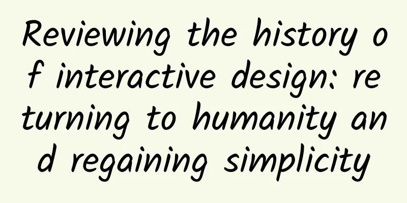
The development history of human-computer interaction design is like a mess, but this chaotic and barbaric development can also create various opportunities. There are countless examples of technologies that claim to be technological innovations but are in fact outdated and unnecessary. Just last month at the 2015 International Consumer Electronics Show, a dazzling array of innovative technologies and products were on display, from touch-controlled extranet-connected smart refrigerators to portable projection dashboards that free drivers' hands and eyes. But any modern product innovation manager can easily add a touch screen to a product and introduce the new features and differences of the product to everyone. I think it is important to reflect on what is lost in this. Consumers seem to have suffered from "novelty" fatigue. People dig for meaning in products and seek humanity in interaction design. From curved screens to smart cups that can automatically analyze liquid ingredients, it seems a bit redundant. These interaction designers are as criticized as anyone who is in the market chain but delays solving problems. Recognizing this problem is only the first step. The future of interaction design lies in returning to humanity again. Back to the Future The author hopes that interactive designers will think carefully about where we humans come from and where we are going before starting to think about the design mode of unrestrained imagination. As early as the beginning of the twentieth century, interactive design was nothing, and the market demand for it was almost zero. At that time, people relied more on physical buttons to directly control various mechanical equipment. The direction in which the lathe handle turns is the direction in which the lathe gear turns, which is very intuitive. Perhaps at that time, the most people needed to do was to design the handle to be more suitable for human hand grasping, rather than the underlying cognition of interactive design, such as "how to make users understand and value this interactive interface", "what role will this obscure interface design play" or "what impact will this interactive design have on our product brand?" It seems that an early example of today's interactive design concept was the typewriter, a super-combination of a word processor and a printer, without having to worry about power. Although the structure was completely mechanical, there was still a one-to-one relationship between the keyboard keys and the output. However, some people imagined that the keys were arranged in a certain non-linear pattern, that is, in an abstract way based on the frequency of words in actual English usage. In addition, the keyboard keys also took into account human tactile factors, such as the maximum average distance that a person's fingers can cover and the spacing between keyboard keys. This scientific innovation is even more humanized after the introduction of patented curved keycaps that cater to the shape of human fingers. This is a model of early interactive design for humans, and this almost perfect design has never changed in 140 years. Although the typewriter looks like a more abstract device, the natural, human, simple and emotional qualities in its design core are indeed worth learning, understanding, and integrating and applying in future design work. From the Remington No. 2 typewriter produced in 1878 to the first Apple Macintosh personal computer in 1984, to the full keyboard smartphone launched by BlackBerry in 2003, to the virtual keyboard of Apple's first iPhone smartphone in 2007. Originated from the human-computer interaction design in the 1970s Human interaction is so basic and natural, and yet tools are still evolving. We have struggled with the abstract and the tangible, the digital and the analog in human-computer interaction. I can’t think of a more abstract invention or a way to highlight the human-computer dialogue. Computers in the middle of the last century could do everything that computers do today, they just ran slower. In hindsight, the speed of computers was not the obstacle to their acceptance and recognition. The problem was that even if super powerful computers were invented at the time, few people knew how to use them and they were abandoned by everyone. The breakthrough of the digital age is not as simple as adding a monitor and keyboard, nor is it the world-renowned semiconductor miniaturization technology. In my opinion, the advent of the digital age originated from an invention in the 1970s that tamed the super beast of the computer, the graphical user interface (GUI), the greatest concept and product in the history of human-computer interaction design. The world's first graphical user interface came from the then little-known Xerox company's Palo Alto Research Center (PARC). In fact, everyone is familiar with the history of PARC and the world's first personal computer, the Xerox Alto. Even Bill Gates and Steve Jobs were fans of Xerox at the time. These two computer giants learned from Xerox and eventually created two large companies, Microsoft and Apple (if you don't believe it, please read "The Victory of the First - The History of Microsoft's Rise"). Xerox's first personal computer (PC) laid the foundation for modern computers. From network offices, writing boards, icons, menus to emails (countless), they were all deeply influenced by Xerox, the originator of PCs. It can be said that Xerox pioneered modern computers with the introduction of graphical user interfaces and "desktop metaphors." Figure: Xerox PC user interface in 1979 compared to Apple's first Macintosh PC user interface in 1984 It can be said that Xerox visualized those obscure and abstract tools in the computer that only technology geeks could understand into a graphical interface that even children can understand and master. All this is thanks to the "desktop analogy" that "translates" the abstract digital world into concrete graphics. Now we already understand how to operate computers, such as files, folders, and recycle bins. Cut and paste, etc. These concepts that were quite abstract before the 1970s have now become an inseparable part of our modern life. It's a bit incredible to say that sometimes I even crop and scale real photo files. Today's highly developed graphical interfaces really blur the boundaries between the virtual and real worlds. Lost and Enlightenment in Interactive Design In fact, we can conduct surveys among hundreds of people in many countries and regions to understand how people associate with these tools. We can certainly find some useful, usable and satisfactory results from these specific survey cases. But for me, watching my 6-month-old son playing alone is very inspiring. Children prefer tactile physical objects and actions, such as clicking, twisting, bubble wrap, bells and block toys. Even for adults, using extremely complex devices at the forefront of human technological development, the best micro-interactions are those that are direct, humane, physical, and in line with human sensory logic (Google's Material UI has mastered this delicate balance appropriately). How humans feel and understand the world around them is of course fundamental, but don't forget that interactive design is also creating a new experience, whether in retail, digital or consumer electronics. Innovative designers should have the ability to present things concisely and clearly, rather than just solving various problems. In the end, we "translate" these interactions into humanized, sensory, emotional and functional expressions. It sounds simple, but it is not easy to actually achieve it. It is easy to just say "add a touch screen", but this lacks the fundamental spirit of returning to the simple innovative interactive design. Extra touch design Touch screens are everywhere these days, and there are many places where they shouldn’t be. Even Tesla Motors’ most popular innovative designers took a different approach with the Model S, ignoring the potential of the traditional driving experience. As far as I’m concerned, I’d rather redesign the center console of the Model S and throw the oversized iPad-like control touch screen out of the car. I think touch screen control can’t compare to traditional physical buttons in terms of convenience, safety, and stability of driving control. Of course, we can't rely on Xerox PARC-style analog design ideas in any single environment. Interaction designers must repeatedly evaluate the design trade-offs between digital and analog interactions. Putting a huge touch screen on the center console of a car and integrating almost all the car's controls into it, but in the "translation" process of this interaction design, users lose something. Touch screen control is indeed cool, but this thing is too eye-catching. Don't forget that you are driving and using your eyes to observe the road conditions. For safety reasons, sensory satisfaction is not worth mentioning. Interactive design product case black and white list diagram The typewriter from 1800, the Xerox Alto personal computer from 1970, the Apple Macintosh personal computer from 1980, the MUJI radio from 1990, the iPod multimedia player from 2000, the Nike motion sensor from 2005, the iPhone from 2007 and the Google Material Design from 2014 are all on the white list; while the watch with calculator function from 1980, the Sony Aibo robot dog from 2000, the laser projection keyboard from 2005, the refrigerator with touch screen from 2007, the Tesla Model S electric car from 2012, the Google Glass from 2014 and the current Samsung curved display and Vessyl smart water cup are unfortunately on the black list. Interactive design that understands human nature is the real The essence of humanized interactive design is to find a balance between sensibility and abstraction according to the situational environment. Designers need to have a deep understanding of the risks faced by each new design, and must carefully deconstruct the universality and novelty of the design, and accurately weigh the gains and losses of new technologies. In short, finding the best balance of interactive design and returning to the focus on humanity is the end point. |
<<: 10 famous code (text) editors
>>: On my journey after quitting my job: I wrote an app and started a company


Recommend
Life scene record | Why do accidents always happen in the toilet?
The bathroom at home has always been a place wher...
Fujifilm X-A1 parameters exposed: 16 million pixels, built-in Wi-Fi
[September 9 news] Recently, the Czech website fo...
Revealing the truth about "lung cancer" in "Zhou Chu Eliminates Three Evils": Can lung cancer be diagnosed with a chest X-ray? Will lung cancer cause vomiting of black water?
Has everyone watched "Zhou Chu Eliminates Th...
ASUS's unique aesthetics of technology and art
On September 20, 2016, the ASUS Zenvolution new p...
Blizzard, heavy rain! A new cold front is coming! Don't rush to take off your thick clothes, it is important to keep warm
This morning, except for some areas in the northe...
Is the effect of bidding promotion declining? You must analyze these 8 factors
Nowadays, most of our SEM promotions revolve arou...
Apps that shorten phone performance: The top 10 most performance-destroying Android apps in Q2 2015
[[152829]] Although Android smartphones and table...
Smart TVs have entered the deep waters. How can we make useless functions more practical?
With the impact of the Internet on the traditiona...
Another asteroid is about to hit the Earth? The truth...
gossip "An asteroid will hit the earth in se...
Why are you not optimistic about the iPhone returning to 4 inches?
"The next generation iPhone will launch a 4-...
Xiaohongshu promotion: Xiaohongshu mini program product analysis!
The development of mini programs provides support...
Why are there more and more cases of "kidney failure" in China? Reminder: Avoid these 6 habits, your kidneys will thank you
Mr. Zhou, 75 years old, found that his urine volu...
Baidu search for the most powerful oCPC advertising secrets!
This article shares with you the "Baidu Sear...
Where is the future of new media operations?
A few months ago, a friend who works in new media...
How was Overtime Wang made?
[[147867]] If the IT industry is the hardest hit ...