
Detailed strategy | How to use resources to boost homepage traffic?

|
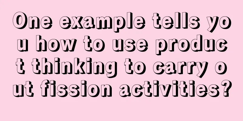
In this article, we will continue to talk about homepage operations, review the distribution, function, and usage of various homepage resource positions, and also talk about usage skills, the logic behind usage, and various pitfalls that you may fall into. 1. Inventory of common homepage resource locations1. Marketing resourcesE-commerce websites have rich marketing resources, including various push notifications, home pages, channel pages, searches, and advertising resources. As long as anything is visible to users, it can be marketed. This article only discusses the home page resource position. 1) Startup screen: Generally, an app takes a few tenths of a second to load. In addition to displaying a static logo, you can also use this waiting time to place advertisements. Recently, many apps pretend to be starting up or preparing for the desktop, significantly extending the time the startup screen stays (even Xiaomi TV has learned this bad habit), and even switching to the background and then returning to the foreground to play ads again. Although the experience is poor, users have gotten used to it. 2) Advertising space: You can sell advertisements in any resource column on the home page. In addition to the startup screen, common advertising positions include search box default words, first focus, big promotion banner, marquee, channel window product placement, and first screen brand visual customization. It can be sold individually, or sold in divided traffic, or sold in a package of multiple resources. If the traffic volume is large, you can also split the traffic to push targeted advertisements, thereby achieving a significant increase in CPC/CPS revenue. 3) Home page focus picture (carousel): Regular resource position, traffic drops sharply after three frames. In addition to configuring fixed content, you can also set an activity pool for each frame for personalized display; or conduct horse racing, where those with better performances receive more exposure. 4) Home page visual customization: Package the visual design of the home page as a whole and cooperate with the brand, such as Super Brand Day. It basically does not change the layout framework of the homepage, but only visually customizes the entire first screen to highlight the brand characteristics, similar to the following. At the same time, it provides an entrance to brand activities to promote brand sales. First screen overall customization 5) Floating window: This resource position is somewhat obstructive, blocking certain locations and also has the risk of accidental touch. Floating windows usually contain sweepstakes, mini-games, check-ins, tasks, etc. to increase user stickiness. It is always in the user's sight, not affected by scrolling, and is easy to notice. It can also be used to incubate new businesses, test new columns, and help cold start. 2. Promotional resources1) Second floor: Press and hold the pull-down button on the first screen, and the app with this resource position will display the second floor. The first design I saw on the second floor was Taobao’s “One Thousand and One Nights”, which was open late at night and used exciting short videos to attract night owls. In addition to content, the second floor can of course also be used to store activity resources. However, this resource is located deep inside and its ability to reach users is relatively weak. You can consider using a "partial display-retract" animation to provide a prompt when entering the homepage. Taobao 2nd Floor 2) Pulling the curtain: Have you ever seen a "small rope" hanging down from the homepage (or similar hint), which, when pressed and pulled down, will pull out a "curtain"? Above are the activity resources. Unlike the second floor, it does not leave the first screen, but is just a half-screen cover similar to a projection screen, showing the entrance to a specific activity. It can be used as a supplementary part of the promotion floor. Its characteristic is high operating cost, and it is suitable for users who have a strong desire to participate in activities. From another perspective, it is suitable for delivering precise matching and providing activities with higher user value or stronger stickiness. You can make an animated reminder when entering the homepage. No screenshots were saved when this resource was first launched. I don’t know if the example below is the same as the original, but the design looks a bit similar. Curtain 3) Big sale floor: the most common non-permanent floor, which is opened during big sale periods. The main venue is at the front, and the entrances to sub-venues are placed on the 1-2 floors below. It is not recommended to have more than two floors overall. More sub-venues can be considered to be displayed in the main venue. Promotion banner I usually develop multiple banner positions on the homepage (but they will not be opened at the same time). The most important banner is above the icon area, the second banner is below the icon area, and the third is on the second screen, below the fist channel. The logic of use is that for the highest level of activities (hereinafter referred to as S-level), we do not want the icon to divert traffic, and try to guide more traffic directly into the event venue. At this time, it is advisable to place the full-width bar above the icon area, or even occupy the first screen. Users can only see the venue entrance at first glance, which can maximize the event traffic. However, if the regular entrance is moved downward, there will be certain experience problems. The second level of activities (hereinafter referred to as Level A) allows the icon to be appropriately diverted to respect the habits of some users who do not participate in the activities. Therefore, it is placed below the icon area, but still appears on the first screen to attract the attention of users across the entire site. The third level of activities (B or below), such as various themed promotions that take place from time to time throughout the year, are placed below the Fist Channel area because of their narrow audience and their sales capabilities are often not as good as those of the Fist Channel such as flash sales. However, they are allowed to appropriately absorb the regular "wandering" traffic that continues to move downward. We can see that the arrangement of the activity banner position should maximize the value of the entire site. Carefully evaluate whether it is globally optimal to use the promotional banner to attract more traffic, rather than believing that the higher the position, the better and the larger the entrance, the better. In addition, the promotion team and I have done a series of in-depth analysis on how to achieve the best arrangement of promotion sessions, duration and waves. I will skip this in this article and share it with you when I write about the activities in the future. Suggestions for using promotional resources: 1) Except for special events such as Double 11 when users are fully motivated to participate in the event, try not to open too many promotional resources at the same time. This may cause the home screen to be extremely chaotic, with resources competing for traffic and users getting lost. The dilution of the event effect will also lead to a greater decline in regular sales, which may not be worth the loss. 2) The promotion level corresponds to the resource package. For example, an S-level promotion can combine the use of multiple resource slots, an A-level promotion can appropriately reduce the use of resource slots, and a B-level promotion can only open a specific resource slot. Home page operations or activity operations should have corresponding resource rules. 3) Set application rules and threshold standards. For example, if you reach a certain revenue expectation, you can apply for a resource position. The higher the expectation, the more exposure you can apply for. Of course, an inventory must be taken afterwards, and even adjustments must be made dynamically in real time. 4) Resource content can be delivered in a differentiated manner based on region, user preferences, traffic segmentation, etc. to improve marketing efficiency. 3. General Resources1) Top tab: In recent years, Taobao and JD.com have added tabs to their homepages, configuring a home screen entrance for each business (typically categories) to bring traffic to the business sub-homepage. Home top tab The problem with the home page tab is that there is not much traffic from the second tab onwards, and the third tab drops off a cliff. It may not be as good as an icon position or a channel after the third screen, but it is better than nothing, so it is not recommended. 2) Icon: The trend in recent years is to have more and more icons, from 1 row to 2 rows, from 4 to 5 in a row, and even divided into multiple horizontal screens. This is very familiar to everyone. Here is an experience that may be easily misunderstood but is very important. Everyone still remembers that the visual heat map test of web pages shows that users focus more on the left side of the screen, especially the upper left corner. In the PC era, based on this principle, the most important information and entrances are generally placed in the upper left corner of the screen. We verified the visual heat map again on the mobile side, and the results were very close to those in the PC era, as shown below. Icon area visual heat map So based on this result, I moved the icon position of an important business from the middle to the first icon on the left in the first row, in order to gain more traffic. Unexpectedly, after 4 weeks of AB testing after the adjustment, the results were unexpected, the CTR actually dropped by 13.1%! In comparison, when the rightmost icon is adjusted to the fourth from the left, the CTR increases by 10.0%; when the fourth from the left icon is adjusted to the middle, the CTR increases by 30.8%; and when the middle icon is adjusted to the second from the left, the CTR increases by 11.8%. In-depth analysis revealed that this is because users often hold the phone with one hand, so they click less frequently in places that their thumb cannot reach. Therefore, unlike the visual hotspot, the middle of the screen or slightly to the right is the click hotspot (as shown below). Icon click hotspot So far we have concluded that the icon position advantage is: middle position > 2nd from the left ≈ 4th from the left > rightmost > leftmost. Simply put, the closer to the middle, the better. 3) Channel position: After the homepage icon and promotion column, you usually enter the channel area. The layout can be divided into layers according to shopping styles and scenes, such as promotion floor, quality floor, and content floor. After the revision of JD.com and Taobao, the homepage became shorter and the channel entrance became very small. Intuitively, this is not conducive to the channel gaining traffic. Later we learned that this was because there were too many channels in the past, with seven or eight screens, and the performance was uneven. Not all business lines could make good use of the homepage entrance, and the traffic on the back screens was relatively low. Therefore, the homepage was significantly shortened in the revision in exchange for an increase in traffic to high-quality channels. In addition, although the channel entry of row 1 and row 4 has an average 35% less traffic than the channel entry of row 1 and row 2, the subsequent screen entry is moved forward, and the overall traffic efficiency is improved. It is worth noting that even though JD.com’s homepage looks short, it still retains more than 10 homepage channel entrances (and a channel pool with dual entrances), plus more than 20 tab entrances and 20 icons on two screens, with more than 50 channel entrances on the homepage at the same time. At the same time, the previous vertical tiling was changed to a combination of vertical and horizontal, and many channels were exposed horizontally. E-commerce companies with fewer shopping guide columns must first provide reasonable multi-dimensional shopping guide columns to provide a professional shopping guide experience. It is too simplistic and crude to rely solely on "guess what you like". 4. Function entry1) Search box: The search box is a regular function entrance, but it can also be used for marketing by configuring default search terms, associative terms in the smart search assistant drop-down menu, etc., as shown below. 2) Shopping cart: This is an important permanent functional position. Don’t mess with it, otherwise users will not be able to find the checkout entrance and the consequences will be huge. 3) Personal Center ("My"): This is where you can store user-related information, such as orders, assets, memberships, etc. It can also store a small amount of marketing resources, such as in-site messages. Apart from using personalized waterfall flow to grab residual value, it is not recommended to sell goods here unless the logic matches. You can use a small red dot to mark new information (such as coupon arrival, order changes, new site messages, etc.) to guide users in and guide member conversions. Internal messages are also often placed in the upper right corner. 5. Communication points1) Home page pop-up window: This resource is very popular, but also very annoying. Because it is mandatory and blocks the entire homepage, users must click for it to disappear, which causes disgust. This reminds me of the website experience in the PC era, which was largely ruined by pop-ups on the homepage. When I set the rules for pop-up windows on the homepage, I usually stipulate that pop-up windows are allowed in the following situations: a. New member gift pack. After all, the newcomers have just arrived, so the pop-up greetings are very considerate, and most of the gift packages are real money. b. Distribution of high-value rights and interests. For example, red envelopes with no threshold for cash discounts, or high-value coupons, etc. It is prohibited to use pop-up windows to inform about those meaningless and useless rights. c.Important Announcement. Such as stopping delivery during the Spring Festival and forced app upgrades. Ordinary announcements can be delivered using a ticker. d. Heavyweight activities for the entire site. In fact, this can also allocate marketing resources on the first screen, without the need for pop-ups. In short, if it is not very important or can really make users happy, try to use home page pop-ups as little as possible. 2) Marquee: This announcement resource, such as JD Express and Taobao Headlines, occupies a very short full-width column on the first or second screen, with content displayed in a scrolling manner, and there may be no landing page. You can put general announcement information or marketing information here. Click to enter. In terms of usage, I do not recommend using all the resources on the homepage for marketing. Different resources are targeted at different things, which makes it easier to cultivate user awareness. The ticker mainly displays announcements. Click to enter the announcement details. It will be closed when there is no announcement. Think about it, if there are often small advertisements posted on the bulletin board at the entrance of the company, how many people would be willing to read the bulletin board? 3) Message entry: Many mainstream apps place in-site messages independently in the upper right corner, and add a small red dot when a new message is received. Don’t underestimate this little red dot, it can double your traffic. I once did some statistics and found that the in-site message entrance with a small red dot in the upper right corner can actually capture nearly 20% of the traffic on the homepage! In-site messages are an effective means of reaching users. In addition to sending appropriate marketing information, you should also send more valuable information, such as notifications of rights arrival, reminders of tight inventory, notifications of new product launches, exclusive events, etc., to cultivate user attention. Author: Xu Xiaopeng Source: Xu Xiaopeng |
<<: A complete short video operation plan


Recommend
6.18 Mid-Year Promotion Public Relations Events Review, Galanz Becomes the Highlight!
The most popular e-commerce festival to date is t...
Macheng SEO Training: How to optimize the website to the homepage? What is the work of SEO?
A website always has to be optimized to facilitat...
Practical Tips | How to create an April Fools' Day event with 500,000 PVs in 3 days with 1,000 yuan!
The biggest phenomenon-level event on April Fools...
Those practical skills for APP operation and promotion are worth collecting!
Regarding the operation and promotion of APP, the...
There is no best copywriting, only the most suitable copywriting at the moment. There is no need to always write it to 100 points!
Regarding copywriting , the author has always held...
APP promotion: Serious user loss? You stepped on these pitfalls!
The fundamental solution is to analyze the reason...
A Japanese mask costs 300 yuan. Why is the mask so expensive?
According to media reports, there has been a huge...
How much does it cost to customize Dehong furniture through the mini program? What is the price quote for Dehong Furniture Mini Program customization?
There are two types of customization of Dehong Fu...
Double 11, Double 12, Black Friday, 6.18…Why are e-commerce festivals so addictive?
Promotion has replaced sales, and we are forced t...
Traffic generation and promotion: Are there any better ways to generate traffic on the entire network?
There are dozens of drainage methods online. Can ...
Analysis of Watermelon Short Video Operation and Promotion Strategy in 2019!
The author will bring you a good short video oper...
Internet finance, how to quickly acquire a large number of real target users?
“Just like true love, you never need to chase aft...
Color Master Class: 8 modules to master color grading skills
Color Master Class: 8 modules to master color gra...
How to design SEM account structure from 0 to 1?
Account structure is a difficult problem for begi...
User incentive system construction strategy
In product operation, the user incentive system i...