
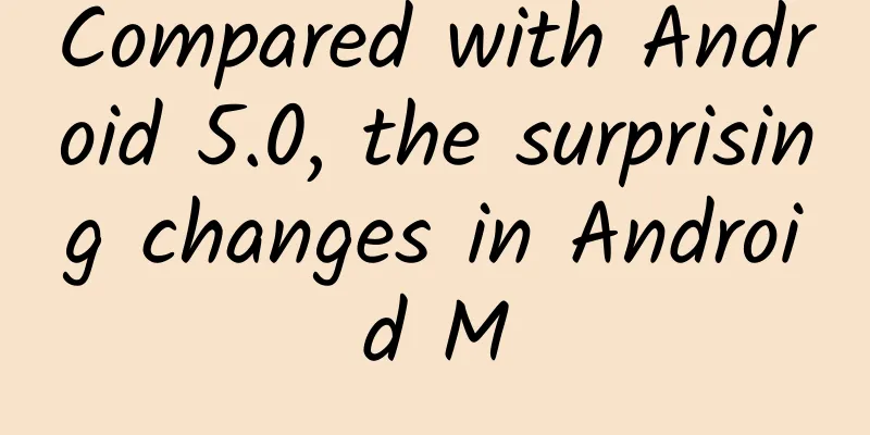
Compared with Android 5.0, the surprising changes in Android M
|
We've got our hands on every Android M demo released so far, and compared them with existing versions one by one. The time font on the lock screen is displayed in enhanced form, and the date is all in uppercase letters. Sort installed applications by alphabetical order. This address book-like format eliminates the need to manually enter application names, and when the number of applications under the corresponding letters is small, the system will also merge them by initial letter. The commonly used function controls have been slightly adjusted and some icons have been redesigned. A more explicit Do Not Disturb mode. By default, the notification volume is adjusted. Expand the drop-down menu to adjust the media volume and alarm volume. This year's Google I/O conference brought us the Android M developer preview, and although it is still in the early stages of development and is purely for developers, we think it is necessary to discuss the differences between the new version and Android 5.0. Overall, the new version of the UI has not changed significantly compared to Lollipop, but Google has made adjustments to the common requests of users in Android M. In this comparison, we cover the latest important information, and refer to the multi-window feature that is still under development from a post. However, there are a number of new features that have not yet appeared in the official release. Perhaps the strangest part of Android M is the new app drawer, which has a capital letter index on the left side of the screen. The effect is a bit hard to read, as the spacing between icons has been reduced. We're not fans of the alphabetical index, but we have to admit that this change from horizontal to vertical scrolling is a nice improvement. It's now easier to jump to the bottom of a long list of apps without having to scroll down the screen countless times. The vertical scrolling mechanism also applies to the widget drawer, which often occupies more than a dozen pages on Lollipop. Lollipop's "top notifications" mechanism, which pops up notifications at the top of the screen, works well but lacks user control. Android M improves on this by letting users categorize notifications on an app-by-app basis, which is sure to make a lot of people happy. Before it's officially released, developers will have to prove whether this mechanism makes sense through actual experience, and of course every developer's opinion is important. In addition, we can now easily control Android's three different volume sliders (notifications, media, and alarms), which are now combined and displayed in a new drop-down menu. We also came across some interesting options that aren't officially available yet. One of them appears to be support for the upcoming Brillo IoT device, a mysterious "Inactive Apps" screen that's not yet known what it does, and a new "Tap & Pay" screen that's supposed to be an onboarding option for Android Pay. |
<<: Touch Technology Cocos Store officially introduces Founder fonts
>>: Where did these 10 problems in a programmer's career go?


Recommend
The amazing oracle bone inscriptions: He was the first person to evolve oracle bone studies from philology to historiography
Wang Guowei Wang Guowei's work "New Evid...
What are the functions of Zhangye WeChat Beauty Mini Program? How much does it cost to develop a skin care product mini program?
The most profitable industry nowadays is the &quo...
Practical explanation of online promotion
Since coming into contact with the Internet, many...
What does Shanghai’s full-area static management mean in 2022? When will it be lifted? Attached is the latest official notice
Recently, the local epidemic situation in Shanghai...
From a global perspective, here are 4 tips to help you improve product activity
For all our promotions , we must identify the tar...
To survive in a sea of fire, what tricks do plants have?
Last year, the Amazon rainforest fire burned 500,...
Apple strengthens privacy protection, iOS 17 can automatically block tracking parameters on websites
With iOS 17 and macOS Sonoma, Apple brings users ...
Tips for attracting fans and traffic to Douban!
Douban is one of the most popular social networki...
Go wild in Changbai Mountain! Explore the secret land of snow country
Huge volcanoes and violent snowstorms coexist A d...
B station places advertisements, and the forms of B station advertisement display
Some time ago, Bilibili released its Q3 financial...
The latest research! This exercise can delay brain aging and improve memory! Stick to it for 6 months and your brain will benefit for at least 5 years
Have you ever had a similar feeling: As I get old...
Baidu information flow is not growing? Learn about multidimensional data analysis!
Whether it is education, games, novels or product...
Tesla delivered 6,244 cars in the UK in Q3, exceeding the total for the whole of 2018
Recently, Tesla announced its third-quarter sales...
Tencent's top 10 open source projects for WeChat and mobile development
Tencent has open-sourced many very valuable proje...
Corolla's monthly sales of 2,268 units lead Taiwan Province. If mainland cars enter Taiwan, how will the market change?
In recent days, Taiwan has been a very hot word, ...