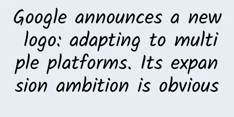
Google announces a new logo: adapting to multiple platforms. Its expansion ambition is obvious
|
On September 2, early this morning, Google suddenly announced the adoption of a new logo. The company said the purpose of this change is to adapt to multiple mobile smart terminals such as smartphones, watches, and cars. This change in Google's logo is also the largest change in the logo style since the company was founded in 1998. The new logo still has six letters "GOOGLE", but the font has been redesigned to adopt a sans-serif style, which is more rounded and modern. The simplified logo "g" of "GOOGLE" has also been changed to a "G" made of four colors. Google will gradually adopt the new logo in all its products. The following is the full text of Google's official blog: Google has changed a lot over the past 17 years—from the generations of our products to the way they look and feel. Today, we're changing again. So why are we making this change? There was a time when the only device people could access Google was a desktop computer. Today, people use Google products across a variety of platforms, apps, and devices throughout the day. You expect Google to help you wherever and whenever you need it, whether it's on your phone, TV, watch, dashboard in your car, and of course, your desktop! Today, we're introducing a new visual language that reflects this reality and shows you how Google can make magic happen on a small screen. You'll notice that we've changed the Google logo and branding, which were originally designed for a browser page on a single desktop computer, and have been continuously updated to adapt to a seamlessly connected world across countless devices and different types of input methods (such as touch, typing, and conversation). This not only shows that you are using Google, but also shows how Google works for you. For example, new elements like the colorful Google microphone icon help you recognize and interact with Google, whether you are talking, clicking or typing. At the same time, we said goodbye to the small blue "g" icon and replaced it with a symbol that is consistent with the overall logo. This isn't the first time we've changed our logo, and it certainly won't be the last, but we think today's update is a great example of how Google is serving you in different ways through Search, Maps, Gmail, Chrome, and more. We think the new Google logo is great (simple, clean, colorful, and friendly), and of course, we made these changes not just for Google today, but for Google's future.
Soon you’ll be able to see the new design across our different products. We hope you like the change! |
<<: Select pictures by imitating WeChat Moments
>>: Phoenix.com announces massive layoffs; established portals are transforming


Recommend
What kind of sparks will the popular game “Asphalt” and CHiQ create?
Not long ago, Changhong Corporation and the world...
Where is the coldest place in the known universe?
The coldest place in the universe is called the B...
Do you really understand product operations?
Internet products have only been proposed as an i...
How much is the price to join Beihai Electric Mini Program? Beihai Electric Mini Program Franchise Price Inquiry
How much does it cost to join an electrical mini ...
If you could do it all over again, would you still choose me as your mentor? — The growth of a "Shamatte" boy
Produced by: Science Popularization China Author:...
To be honest, the kitchen tools commonly used during the Chinese New Year may be dirtier than the toilet!
Where do you think your home is most likely to br...
Drones: From “useless” to “pioneer”
Written by reporter Duan Ran Edited by Ding Lin N...
2019 Second Category E-commerce Promotion Insight Report!
The traditional e-commerce dividend has passed. I...
Hunter e-commerce · Toutiao's brick-moving gameplay makes a profit on the same day, and the account starts in three days (exclusive)
Hunter e-commerce · Toutiao's brick-moving ga...
User surveys are essential skills for operations, with two forms and five methods
A newbie who has no basic knowledge and switches ...
How to follow mini programs on WeChat? Where are WeChat’s mini-apps?
Nowadays, the application scope of mini programs ...
What qualifications are required for the WeChat Mini Program Mall?
WeChat Mall mini programs generally require a &qu...
I have a privacy film, but others can still see my phone screen
A while ago, a piece of news about "spy film...
Pinduoduo platform operation and promotion strategy!
There is no doubt that price is Pinduoduo's a...
“Riding on the popularity” doesn’t work anymore? No, it was ruined!
At the beginning of the article, we are going to ...