
A guide to app structure for beginners: Home page related (Part 2)

|
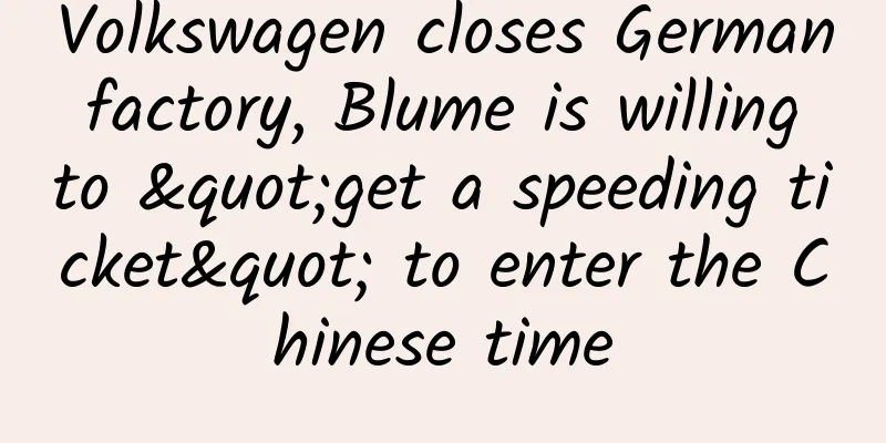
The function inventory of "APP Structure Guide for Newbies: Home Page Related (Part 1)" has been updated for a while. I hope it will be helpful to you. Today I will continue to share with you the second half of the home page related functions. Let's take a look at the overall structure first: △ The picture comes from the application screenshot and is only used for learning and communication 1. Navigation form When it comes to navigation, everyone should be familiar with it. Navigation is a tool for switching between various functional scenarios and is the overall framework of the product's functions. It connects the functions of the product in an orderly manner and allows the functions to appear in reasonable locations. Without navigation, users will be at a loss when using the product and will not be able to find a function quickly. This shows that its significance is very important. There are many articles on navigation on the Internet, which detail the differences, advantages and disadvantages of navigation forms. I guess it would be repetitive to write more, so I will just briefly talk about it here. If you want to read detailed articles, you can search online yourself. (Editor's note: More good articles on navigation design → Navigation design) The navigation categories are: 1. Bottom tab navigation The bottom tab navigation is the most common, most used, and most user-friendly style. It is the most popular style in navigation. According to the thumb heat map, the thumb's maximum operation area is only one-third of the page, so the tab navigation is often located at the bottom of the page and is generally used as a global navigation. The navigation content is the most intuitive and will not be hidden, and the selected tab will be highlighted to clearly tell the user the current location. The user can easily click the tab to switch pages. 2. Top tab navigation This type of navigation is also very common, and is often used in conjunction with bottom tab navigation as a secondary auxiliary navigation style. Generally, there are more than 3 tabs, and they can be switched by swiping left and right. Of course, it can also be used as a primary navigation. For example, in Android's design specifications, the top tab navigation is used as the primary navigation. Another example is QQ Music. Due to the core functional needs of the product, the shortcut entrance to the music playback page is always placed at the bottom of the page, so the main navigation uses the top tab navigation. 3. Rudder navigation Rudder-style navigation is also called point-gathering navigation. In fact, I feel it can be classified as a bottom label navigation because when the two are used together, it is often placed in the middle as the core function entrance, forming a symmetry, so it is called rudder-style navigation; the design will be clearly distinguished from other labels and highlight itself, which can easily attract the user's attention and encourage users to use this function, but because it is too obvious, it will weaken other function entrances; for example, products with social attributes will hope that users will post more UGC content, and this form of navigation is often used; this type of navigation often contains the most commonly used or most important functions of the product, and the number of expanded functions should not be too many. 4. Navigation Drawer Drawer navigation, also known as hamburger or sidebar navigation, is also a very common navigation style. It is mostly used in reading products because it can give users an immersive reading experience. Many low-frequency functions can be hidden in the drawer navigation, saving screen space, which naturally makes the page look simple and beautiful. Some products are more complex in function, so drawer navigation is often used as auxiliary navigation. For example, QQ has both bottom label navigation and drawer navigation. Another category is products with strong purpose, such as shared bicycles or taxi apps, which all use this type of navigation, putting the core functions that users need most on the homepage, and hiding the others so as not to interfere with users' attention. Of course, there are many disadvantages of this type of navigation, such as users may not remember to expand the hidden functions, and users need to do more operations to enter other function pages. 5. Palace Navigation The most representative example of this navigation style is Meitu XiuXiu. This type of navigation is visually neat and intuitive, which is convenient for users to find quickly. This navigation style can be used when there is a large sense of separation between functions of the same level or there is no great correlation between functions. Although this navigation style can have a large number of functions, it is still recommended to use this navigation style as auxiliary navigation. On the one hand, users are relatively unfamiliar with this navigation style and may not be very receptive. On the other hand, due to the large sense of separation between functions, it may be troublesome for users to switch to other functions. For example, the category entrance under the banner of the WeChat wallet page, e-commerce and group purchase product homepage also belongs to the palace navigation style, which is used as auxiliary navigation. 6. List Navigation This type of navigation is very common, so common that we may not even realize it is also navigation. It is visually neat and beautiful, and is used in almost all products. List navigation is similar to palace-style navigation, except that it differs in presentation. There are many forms of list navigation, such as pure text/icon+text/text+picture, etc. There can be a lot of lists, and there are no limitations because users swipe up and down to view. It is often used as a secondary navigation in combination with other navigation because it is inconvenient for users to switch functions, and lists too low may not have a high click-through rate. 7. Floating navigation This form of navigation is also quite common. As the screen of mobile phones is relatively large nowadays, this navigation method is increasingly used. It is often used as a secondary auxiliary navigation and is more common in reading or tool products. Clicking on the navigation is often accompanied by animation and several functions appear. These functions are aggregated in the floating navigation, which saves screen space but interferes with the user's vision. summary Navigation form is not a single existence for products, especially today when product function structure is becoming increasingly complex and huge, the combination of navigation is the norm and a major trend. Therefore, when designing products, it is necessary to analyze them specifically according to your own needs and use the navigation form that suits you. After all, the one that suits you is the best. 2. Top banner ad space Banner ads are inevitable for almost all products. They are also one of the ways for products to operate or make profits. The number of banners generally ranges from 3 to 8. You can swipe left and right to view them. Click to enter related topics or detail pages. Banners for e-commerce products are generated based on user preferences. The system recommends content that users may be interested in, and the click-through rate can be imagined. Common banner design ratios include 2:1 and 16:9. Of course, this is not fixed. The height can be determined according to product needs. For example, the space on the homepage of e-commerce products is relatively precious, so the banner height will be relatively compact to save page space. When designing banners, we *** use the screen's maximum width size for design, that is: Android (@4x) width 1440px (different companies may upload different sizes in the backend, just for reference). Although this will take up more resources, it can avoid possible blurring when adapting to the following screens. Since the launch of iPhone X, in order to avoid the interference of bangs on the banner, more and more products have cancelled the previous transparent effect of the status bar and navigation bar, and placed the banner under the navigation bar; currently, JD.com still retains the original style among e-commerce companies. The points to note about this style are: 1. Leave a top danger zone The area below the status bar and navigation bar is a danger zone. Do not allow important content such as text to appear in the danger zone. 2. Top black transparent mask Because the color of the banner is uncontrollable, in order to highlight the status bar, the developer will set a top-down black mask with a value of 70%-0% at the top. 3. Display the background color of the status bar and navigation bar when sliding up The developer will set a value, such as the total height of the status bar and navigation bar, which is 128px (@2x). When the page as a whole slides up 128px, the status bar and navigation bar will change from fully transparent to opaque and show the background color/gradient color. 3. Classification module entry The entry to the category module is usually located below the banner on the homepage, and is very common in e-commerce, group buying, and other products. Many users may not know what keywords to search for or are more purposeful in finding a product, so this quick category entry is very convenient. A classification module usually has 1-2 pages, with 4-20 categories. Because the click-through rate of the first page is generally higher, please put the most important categories on the first page to make them easily accessible to users, and put relatively less important categories on the second page. You can also set the first category on the first page to "More Categories", which can reduce one page, but the click-through rate of the categories inside may not be high. Icons are generally designed with a planar icon or a planar icon + a circular/square background (gradient color), because this will make the icon appear fuller visually; the design of a planar icon is not just about the highlight effect, but you can also add some design details for contrast, which will make it appear more layered; linear icons are not recommended here, because they will appear too weak in visual impact and not prominent enough. 4. "Information/News/Breaking News/Headlines" entrance For operational needs or brand-related publicity, or information about products, this type of entrance is usually located below the classification module on the homepage, in the center of the page. Although the position is relatively prominent, it does not take up much space, so users may not pay much attention to it. Font: The font here generally does not use the system's default font. It is usually designed and has brand font relevance; for example, the "JD Express" font and JD's Logo font are associated with the brand. Content: Generally, it adopts a carousel method, which changes every 3 seconds or so. Some are one line, some are two lines. Clicking will enter the relevant topic page. 5. Bottom Tab Bar The tab bar has been mentioned in the navigation mode above, so let’s talk about it in detail here. In terms of design: the height of the tab bar is 98px (@2x), and the font in the tab bar is used as a prompt with a font size of 20px; there are generally 3-5 tabs, and the icon design should be simple and able to accurately convey the meaning. The brand gene can also be integrated to highlight its own tone and differentiation from other products; linear and planar icons are commonly used, and are generally used in combination to indicate the selected state; planar icons became popular after iOS11, and brand colors are used to distinguish them; in addition, the design of the icon should be unified, such as the thickness of the linear icon, the angle of the fillet, the size of the opening, etc. should be consistent, so that users will find it more pleasing to the eye. Feedback: It can be divided into two aspects: visual and auditory. Visually, the current selected state should be clearly distinguished from other icons, such as linear and planar distinctions, color distinctions, etc., to indicate the current page location; in addition, when clicking the icon, there will be dynamic effects, which can increase the fun and is also a common feedback method now; auditory feedback means that when clicking the icon, there will be a click sound effect, such as Facebook. Hidden function: Click the icon again to pin the page. The familiar pinning function is to click the status bar or the pin button. Many users may not have discovered this or rarely use it: Click the current page tab bar icon again to pin the page. Many products may have this function, but they do not provide good guidance to users. On the other hand, Taobao and MONO will guide users to pin the page in the tab bar when swiping up, which provides a better experience. In addition, Taobao Piaopiao uses double-clicking the tab bar icon to pin the page. This is probably to avoid user misoperation, which causes the content the user is browsing to move up and requires a long time to swipe again to find it. However, many users may not know about this interaction. In order to obtain an immersive experience, the tab bar can be hidden when the user is browsing, such as being folded when swiping up and displayed when swiping down. 6. Loading method The loading method is not limited to the homepage, but runs through the entire product. Loading is when the user is performing an operation, the server processes it and feeds back the data to the user. The user is unaware of what the time spent in this process is used for, so there is a need for a loading method to provide feedback and reduce user anxiety. There are many articles about loading on the Internet, I will just briefly talk about it here, and you can search for it yourself if you want to know more. 1. Pull down to refresh and load This loading method has been mentioned in the second point "Pull down to refresh" in the previous article, so I won't say more. 2. Progress bar loading It is mostly used on the web. This loading method does not know the specific loading time. It can load faster at the beginning and slower at the end. In this way, users will be more willing to wait, but it cannot get stuck during loading. There are not many mobile terminals using this method, most of which are H5 pages, because this loading method will attract too much user attention, and the progress bar may not be displayed when the loading speed is very fast. 3. Full screen loading Refers to the loading method when users enter a new page. Before all content is loaded at once, no content can be seen, and naturally no operation can be performed. Therefore, it is best to use emotional loading animation design, because interesting animation feedback can avoid user anxiety; but in the case of poor network, long loading time will make people feel impatient, so the bounce rate of this loading method is relatively large. 4. Segment loading This type of loading method can also be said to be pull-up to refresh loading. The usage scenario is generally when the user swipes to the bottom of the feed flow and continues to swipe up or clicks to load the data. When making interactive documents, you should indicate how many data are loaded at one time. This needs to be determined according to the product's own needs. For example: if you only load content, you can load 50 items at a time, and content data with pictures can load 25 items at a time. I have experienced that the dynamic data of WeChat Moments is loaded 20 items at a time (I counted it myself, it may not be accurate). 5. Step-by-step loading As the name implies, it is loading step by step, giving priority to loading content that takes up less resources. There are two situations: the first is to load text first and then load images. The sudden appearance of images will disturb users. This is a poor experience and has been gradually abandoned; the second is to load the page framework first and then the page content, such as loading the image placeholder first. The placeholder can be gray or the main color of the product (+logo or icon)/color (the color is set in the background and appears randomly), then load the page text, and finally load the image in the placeholder position; the advantage of this loading method is that it allows users to quickly understand the overall structure of the page, and the experience is better. 6. Lazy Loading It means that the content will be loaded only when the user needs it, so as to avoid wasting traffic and resources. For example, when the user is scrolling through the feed, the image content will be loaded when the user swipes up and is seen, and only text and frames may be loaded when the user swipes down and cannot see the content. 7. Load It is commonly used in reading products. It means predicting the user's next operation and loading the content of the next page in advance to reduce the time required for loading when the user enters the lower-level page. It can be used in conjunction with the smart loading described below. For example, preloading can be used in the case of wifi, but not in the case of 4G, to save traffic, which provides a better experience. 8. Smart Loading It means that the content loaded is different in different network environments. For example, in 4G network, in order to save traffic for users, text content and standard-definition pictures are loaded in the page, and videos are not loaded or only standard-definition videos are loaded. However, considering that some users have more traffic, users are now given the right to choose, such as pop-up windows to remind users whether to use traffic to load or switch to high-definition mode; while under wifi conditions, high-definition pictures or videos can be loaded automatically. summary There are various loading modes, and the same page may have multiple loading methods. The purpose is to save time and improve user experience. This is a prerequisite. In addition, the loading animation method can use more emotional design, which can make users forget the current waiting, deepen brand memory and is also a major design trend. The location of the loading animation can reasonably use the location of the page to reduce interference to the user. In the case of loading failure, feedback should also be given, and the user can be allowed to reload. Summarize That’s all I have to say about the homepage. Although the homepage may seem very ordinary, it actually involves many functions. Some functions are quite subtle, and the function layout of the homepages of different products are also different. What I am talking about here are some common functions of the products, and I haven’t gone into detail. I hope I will have the opportunity to talk about them in detail in future articles. |
<<: 2018 Apple Developer Account Application Process
>>: Want to design UI for iPhone X? Here are 11 design tips


Recommend
Can we grow vegetables without sunlight? Scientists come up with a new method | Environmental News
Hello everyone, this is the 30th issue of the Env...
What are the functions of merchant mini program development?
1. Promotion function: After opening the mini pro...
Haidilao is praised, but Didi is in trouble. Let’s learn about the DISCO principle of public relations crisis management
Many companies have recently encountered crisis c...
Soul and Tantan product analysis
With the continuous development of the Internet e...
How to do cross-border e-commerce operation data analysis
As the proportion of younger generations among cr...
Do you think being a pig is easy? You can grow 1 pound of meat by eating 2 pounds of grain. Why don’t you try it?
Obtaining a stable food source is probably one of...
The latest application market promotion strategy in 2015
1. Overall Logic There is only one logic in runni...
Why do you always get cheated when you are so smart? Uncover the psychological secrets behind telecom fraud
In recent years, "telecom fraud" has be...
15 lessons on financial management for women, teach you how to plan your household expenses from scratch and earn enough to buy a house at home
Her name is Wei Xiaowei, a mother of two who deal...
How do you deal with “traveling poop”? | Science Museum
Have tried Going to the toilet at 120 kilometers ...
Tesla was beaten by BYD, and its net profit fell by 44%. Musk rarely admitted his mistakes.
Tesla recently released its third-quarter financi...
"Thai fragrant rice" is actually mixed with essence! What's going on? 4 tips to help you choose the right rice!
Every year’s 315 Gala is always “shocking”, with ...
Ahhh, it's winter already, why are there still so many mosquitoes recently? !
Recently, I wonder if friends in other parts of t...
How to acquire seed users without money or resources?
When a new product is just starting to operate, I...
Electric Technology Car News: How can the Lifan X80, which is very similar to the Highlander in appearance and interior, make a comeback?
This year, the automobile market has welcomed man...