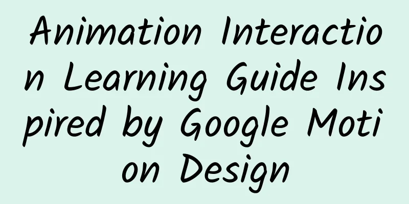
Animation Interaction Learning Guide Inspired by Google Motion Design
|
“This is a study note on the animation part of a material design document. When you present the interactive design in the form of animated images and make it part of your portfolio, it can greatly increase the appeal to admissions officers and thus improve your chances of admission. Let’s take a look at these contents to help you do interactive design well.” Summary
1. Material Design Animation Interaction Google's previous design language was card design, and this generation, as an extension of the card, Material Design is inspired by paper and ink. The design metaphor composed of paper and ink runs through all the details of the entire material design, and animation design is no exception. Where is it specifically reflected? Don't worry, listen to me one by one: First of all, the starting point of animation design, I personally believe that each animation effect should be meaningful. The importance of motion effects can be simply reflected in the following three aspects:
The above is the Tao, what is the technique? 2. Three principles of animation speed 1. Animation should be fast and slow, and we must realize that linear speed will make users feel tired. So how do you achieve fast and slow? 2. The speed should follow the principle of fast in and slow out. Fast entry and smooth exit will make users feel happy. The speed comparison is shown in the following figure: Please do this. You can clearly feel the green ball moving in quickly and out slowly. Please don't do this! The red ball goes in and out at the same speed, which is not harmonious. 3. The animation speed should be different for different components. Following the physical laws of the real world, small components can complete acceleration and deceleration in a short time, while large components take more time to complete acceleration and deceleration. On a superficial level, it can be understood as small is fast and large is slow. 3. Interaction methods I personally think that every operation of the user should be responded to. When the user gets a very beautiful and logical animation effect, the user will feel happy. (My cat: Shit shoveler, come and please me →_→) This will encourage the user to further explore the software: What will happen if I press this? I will click another one. Google officially introduced three interactive examples:
Surface interaction design is the most common interaction method. The oldest one can be traced back to the color change of the link when the mouse hovers/clicks. In material design, the metaphor of ink is used. Ink is the surface phenomenon covering every piece of paper, so when you click, it is like covering it with a layer of ink. Google has demonstrated an elegant way to achieve the ripple effect when clicking. One detail here is the center point from which the ripples spread out. This center is always the point of interaction where the finger clicks, or the point where the mouse moves in.
Surface reaction comes from the metaphor of ink. But elements in the material, such as buttons, can also respond by themselves, such as showing or hiding menus: The correct approach. The object appears from the touch point, and the visual connection between the pop-up menu and the button can be felt visually. No! He came in from the middle and cut off the connection with the touch point. If you are careful, you must have discovered that many interactive effects in daily apps can be classified as "feedback from the object itself." For example, when you like a WeChat post, the heart becomes bigger. When you like a Weibo post, the thumb becomes bigger. Strong feedback can bring physical and mental pleasure.
The user's operation behavior will have a center point, through which the user inputs their operation intention into the system. Establishing a strong visual connection with the user's input point allows the user to more clearly know what he is doing, whether it is from a finger touching the screen or inputting sound from a microphone. Animation effects across the screen should trigger animation in a forward manner as the distance from the center point increases, just like creating a ripple animation. The above text is copied by me, just as an example: 4. How to design meaningful animations When we design interactive animations, to put it simply, we are directing the following three elements: Incoming components: These may be directly added components or converted from other locations. These components have their own way of being introduced or reproduced. Departing components: Components that are no longer relevant to the new content must be removed by appropriate means. Shared elements: Elements that persist from the start to the end of the transition, such as small icons or large, eye-catching images, that change to fit the screen size through animation. Set a flag: Smart friends, look at the example of Gu Shen below and tell me what they are? Old man, I know: Entry elements: singer background photo, album information, play button, album tracks, return button, yellow transition animation Leave component: hamburger icon, yellow transition animation Shared components: album cover, song playback control bar, search, more directories Got this? Next time when you analyze animation, you can analyze it from these three dimensions. Notice: When designing your animations, keep a few things in mind: Think about how the user's attention should be directed? What kind of elements or actions can help this goal? How should the elements that enter, leave, or share be emphasized or weakened during the animation process? When designing the screen, think about the states before and after the animation, and find opportunities to create visual connections through color and shared elements during the transition process. Add motion judiciously: Think about how you can make the transition clearer and smoother by moving an element. As an example below: Please do this. By animating up and down, like a curtain, the touch point creates a visual connection with the new scene. Yami Butterfly! There is no animation transition, and the appearance of the new scene seems inexplicable. 2 methods available: a. Hierarchical time difference: A more layered display animation can guide the user's attention and distinguish the primary from the secondary. b. Direction of consistency: It creates a visual connection and the animation is clear and smooth. 5. Delightful animation details Creative animation details can surprise users: Two examples of icon details provided by Google: The creation of these details requires inspiration, and inspiration needs to be accumulated. Before you create, appreciation is very important. Here are some practical resources for accumulating interactive inspiration: Capptivate: Capptivate is a website that aggregates APP dynamic effect Design Pattern littlebigdetails : LitterBigDetail is a website that aggregates micro-designs Dribbble: famous designer website Behance: Same as above However, the above two documents are not complete, because Google Docs will update the content at any time, so the examples in this article are the latest examples of the English version. And the official version is indeed the best in terms of typesetting. Some translated documents in the mainland are incomprehensible due to errors in the typesetting of pictures and texts. So it is best to learn by comparing them. |
<<: "Light" talk about the design concept of H5 mini games
>>: Write quality code that others can understand


Recommend
I feel dizzy when I wear a turtleneck sweater. It turns out there’s something wrong with my neck!
Review expert: Yin Tielun, deputy chief physician...
Internal email from Tencent COO: Five tips for building the best team
[[121205]] Dear classmates Welcome to Tencent and...
After eating "cat shit", they turned into attacking wolves | Nature Trumpet
Welcome to the 23rd issue of the Nature Trumpet c...
SMIC: 2Q20 conference call transcript: Full-year revenue target still grows 15-20%, gross profit margin higher than last year
According to the financial report released by SMI...
Breaking the record! 16MW offshore wind turbine "turns wind into treasure" with unique skills
He Liang, a reporter from Science Times Recently,...
An event planning and execution form template
one Over the years of work, I have participated i...
They have been enemies since the Ice Age, and now they still "love and hate each other"
Produced by: Science Popularization China Author:...
Exclusive interview with BroadLink's Liu Zongru: Only an open ecosystem can lead to a future in 2015
[[126603]] 2014 is a key year for the rapid devel...
SEM account performance is not good? 80% of the time it’s because you are thinking wrong!
After reading this article, you can improve in th...
6 tips to help you improve user retention!
Retention rate is the most important criterion fo...
Sanxingdui's "world's best" will be on the Spring Festival Gala in the Year of the Tiger, and it is still amazing after 3,000 years
On the eve of the Lunar New Year, at the "Sa...
How to evaluate the stability and quality of an App?
"Crash", like "stuttering" an...
Insights: The best life for adults
Famous Artists Gallery | Chen Banding, also known...
Create a father for yourself: How Google changed the world again
The giant Google is going to reorganize. On Augus...
Why is it that some people can fall asleep no matter how noisy it is, while others wake up at the slightest noise?
One minute with the doctor, the postures are cons...