
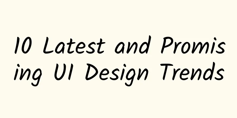
10 Latest and Promising UI Design Trends
|
Lately, I’ve been spending some time observing the direction UI design is heading in. I’ve stumbled upon some very creative, promising, and inspiring trends that I think will impact UI design in the near future. Here are 10 trends I’ve observed: 1. New Homomorphism You read that right! Neuromorphism is on the rise, and I guess it’s here to stay (whether you like it or not). It didn’t last very long in its original form, but it’s moving towards something more sophisticated and accessible. It’s almost like skeuomorphism, but with a fresh, modern, more aesthetic vibe. 2. Soft Gradient Gradients are everywhere! In fact, I see them a lot in backgrounds and on UI elements like buttons, cards, and graphics. Mixing more than two colors to create colorful blurred backgrounds is also a thing! 3. Geometric elements Both are used as the main background or subject, or just as details to make the design look more interesting - geometric elements gain more and more attention. Often they are mixed together to create a mosaic - and the result looks really cool! 4. Soft background I must say I love this trend. I have seen many amazing, light, eye-pleasing designs with very sophisticated, bright pastel color schemes, and it makes for a very modern, non-intrusive, fresh and pleasant look where the content plays the main role. Otherwise it is just a subtle background. 5. Illustration and 3D Illustrations are still in fashion. Different styles, different color schemes, more or less abstract so they match the character of the product. Not just flat, but imitating a 3D look. I believe that after all these years of using stock images for every digital project on the planet, this is a nice change! I give here some tips on how to create simple illustrations: 6. Abstract Shapes Used for backgrounds and different UI elements. They make the interface look more "organic" and playful, which I think is a good thing. Edit the simplest shapes (square, ellipse) with the pen tool, play with different border radius, experiment with different colors/gradients and you might get very interesting results. Or just save a few minutes and try a simple yet amazing tool called Blobmaker. 7. Dark Mode Dark mode is a color-inverted version of an interface to make it more accessible at midnight. Since I’m a typical night owl, I often use dark mode to swipe through my favorite apps before going to bed. When creating a dark mode, remember to maintain the right contrast between different elements and typography. 8. Elements at an angle Not only for Dribbble shots, but also as a way to present different content on the website in a non-standard way. It makes the content look more interesting and eye-catching. How to quickly achieve this effect? First, make a collage of the elements at 0° degrees. Make them a group. Then, change the group angle (from 30° to 50°) and voila! This way you don't have to change the angle of each element manually. 9. Soft shadows 10. Simple thick font |


Recommend
A zero-cost online earning project with no threshold, integrating WeChat groups to realize multiple monetization and earning 300+ per day
A zero-cost online earning project with no thresh...
A girl born in the 2000s escaped from a room three times in one week and developed a lung infection! Cryptococcus must be prevented
recently #A girl born in the 2000s escaped from a...
Analysis of 4 aspects: How to operate?
How to operate it? Where is the output value of t...
Event promotion and operation: How to conduct a complete event review?
Whether it is an online or offline activity, whet...
Cross-border e-commerce has also fallen in love with live streaming?
Unlike previous Double Elevens, this year's D...
Low-absorption Queen Cycle Queen "Queen Trading System Course" Eighth Issue May 2022
Low-absorption Queen Cycle Queen "Queen Trad...
New changes to WeChat Moments in iOS 7.0.18, no option to turn it off
Five days ago, iOS WeChat launched version 7.0.18...
In addition to disguising itself as an orchid, this mantis also has the unique ability to glide!
|||| For a long time, people have speculated that...
Event planning: 9 major promotion channels!
How to systematically understand the planning pro...
Until 3,000 years ago, the human brain was in a "split" state?
Leviathan Press: The "two-mind hypothesis&qu...
"Glass flows?" This is a misunderstanding!
If you visit old churches that are hundreds of ye...
WeChat and Alipay personal payment codes are disabled. Does this have any impact on ordinary users?
There are different interpretations on the Intern...
The internal competition of new energy vehicles is escalating, and the price war is getting higher and higher. This may not be a good thing.
The automotive industry is undercurrent, with pri...
Good news for debugging database in mobile phone: Android-Debug-Database
Currently, debugging apps in the browser is becom...
Uncover the story behind "Oppenheimer" that Nolan didn't film
Recently, the biographical film "Oppenheimer...